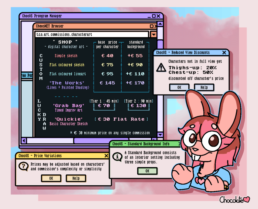
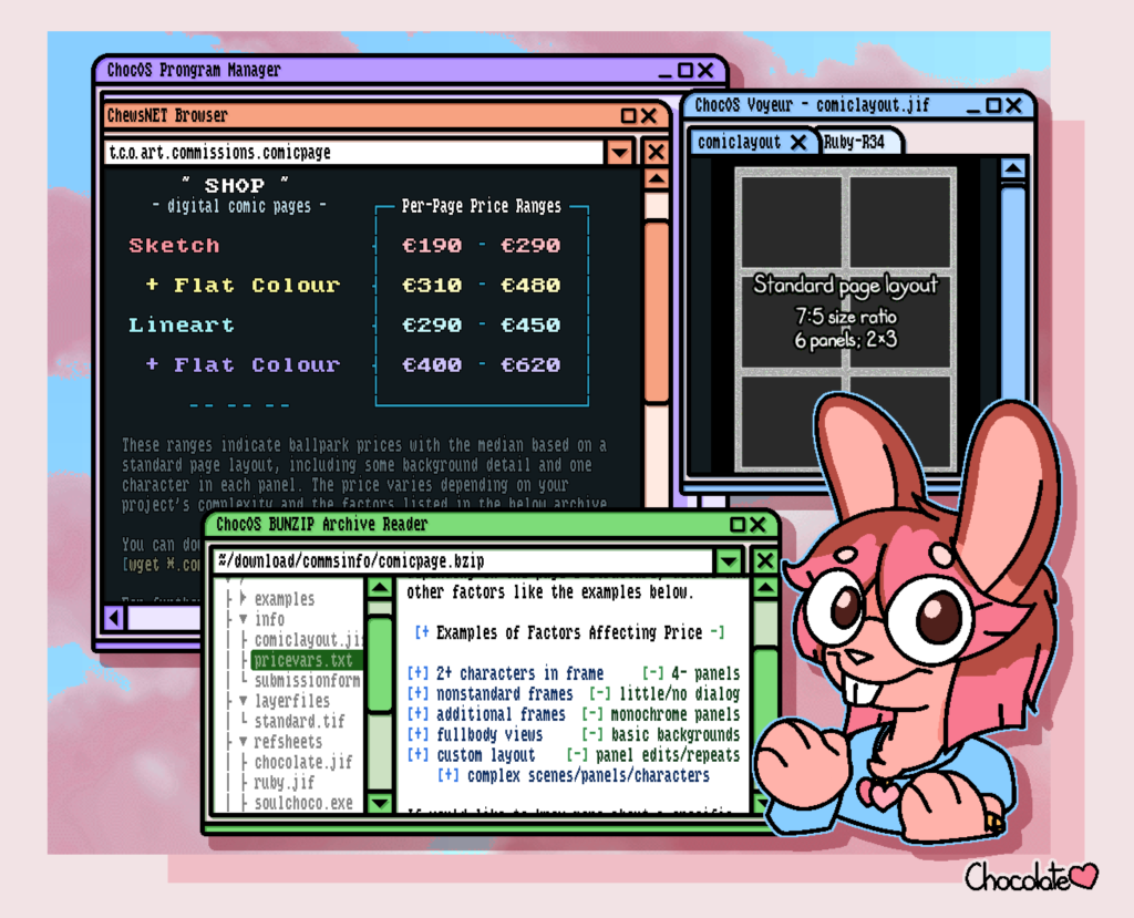
For a while now I've wanted to revamp my themed, "branded" promotional artwork, and I was inspired while watching a stream vod where the streamer had their desktop on full display with a really cozy vibe to it.
That, combined with my love for things retro and synthwave led me to design a new template based on lots of old things instead. I plan on using this for a few different things, but I figured I'd put it through its paces by remaking my commission pricelists since they're overdue for an update.
Here's two of a set of four. I'm really quite pleased with how they turned out! While it's a little bit chaotic for the amount of information presented, I think it still makes for a nice balance where it's nice to look at, but still quite easy to understand what's being conveyed.


This is a really fun theme! I look forward to seeing it in action. I will say, the text is a bit hard to read with the slight blur/shadow effect it has. My favorite part is definitely the color palette! Despite there being a lot of colors present, they all fit nicely together.
As much as I love the aesthetic and the jokes (SoulChoco being an .exe lol), it does honestly feel cluttered and a little hard to read. I’m not sure where to look first, with all the information being on separate layers and information being embedded in windows with other text, and I don’t know whether it’s the font, colours, drop shadow, or it’s just me, but the text isn’t particularly appealing. I would however put stickers of that Choco art with a speech bubble of “Have you considered _______” all over the place
If I ever get back into selling stickers you best believe I’ll be making some of ChocOS Desktop Assistant.
I took your and Mala’s advice and tweaked the lettering a little to try help readability at the very least. If you refresh the page a few times it should load the edited versions. While I get what you’re saying about the cluttered look, unfortunately fixing the layout is gonna mean doing everything over again. ^^;